Reimagining The
Prepr app

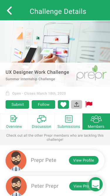
This design challenge landed me a UI/UX design internship at the Prepr Network. Over a span of 3 days, I was asked to redesign some of Prepr's key pages, including the Explore page, Labs page, and Challenge Details page. My final set of deliverables includes a heuristic evaluation of the app's current UI/UX, lo-fi wireframes, and a hi-fi interactive prototype. The tools I used were Adobe Illustrator, Figma and InVision.
This challenge was the first time I had to complete a design sprint in under a week. It was a lot of fun and really pushed me to be careful with how I managed my time. The following are some points to be aware of before reading ahead.
Alright, that's enough disclaimers. Let's jump right into it!
This week (March 15th - March 18th) was an interesting one to complete a design challenge, since the corona virus has enforced the global population to condemn themselves to social isolation in an attempt to reduce the spread of the illness. As a result, though I normally would've evaluated the app with target users by observing them as they performed various tasks, I resorted to completing the initial usability evaluation on my own, with the Neilsen Norman Group's 10 Usability Heuristics for UI Design serving as my guide. The results of this evaluation are shown below.
Note that UI/visual issues are represented by blue dots, while UX/usability issues are represented with red dots.


There were a number of UI and UX issues that I noticed in my evaluation of the current state of the Prepr app, but these can be summarized into the following key issues.
In the redesign, I worked on resolving these three major issues through changes to both the UI and UX.
Now that I knew which issues I wanted to tackle, I sketched out some of the essential screens to start bringing the reimagined experience to life. I chose to redesign the Explore page, Labs page, and Challenge Details page, leaving out the Projects page simply because it didn't contain a lot of content, and the Challenges page because it was very similar to the Challenges tab of the Explore page.
My redesign justifications are included as annotations next to the wireframes.


Once again, under different circumstances I would have liked to have tested my wireframes out by having users perform some basic tasks with them (perhaps with the help of POP by Marvel to make them interactive), but given the current limitations on human interaction and the time crunch, I went ahead with just designing the app UI in high fidelity. My overall goals were to keep the visual appearance of the app minimal and bright, and do away with any design issues that were inhibiting the interface from having a modern look, such as sections written in serif style and tabs with dark grey backgrounds that did not pass the accessible colours test.


Finally, as a quick exercise, I threw the hi-fi mockups into a quick InVision prototype to bring it to life.
All in all, I had a fantastic time working through this design challenge. It certainly shook up my day-to-day routine, as I found myself thinking about the problem space and potential solutions at random points throughout the challenge period, continuously mentally iterating on my ideas as I gathered inspiration from the world around me.
As great as an exercise as it was to get my UX gears turning, this challenge truly renewed my appreciation for user feedback. I sincerely believe that iteration is the only way to build great products, but despite the versions I went through to reach a final design solution, the key ingredient that was missing throughout was user feedback. As I kept iterating with little user input, my designs were not able to surpass my own personal opinions and biases.
Therefore, though the solution I’ve presented may be a reflection of my abilities, it does not necessarily reflect the full potential of this product, which I strongly believe can be capable of so much more once we incorporate user feedback into the process. I’m glad to have reached this realization through the challenge, and extremely thankful to Prepr for the opportunity. Looking forward to more thought-provoking exercises like this in the future!