Preparing for a pandemic
Prior to reading this case study, have a look at the poster that I designed to support the Toronto Western Hospital in spreading awareness about correct PPE practises in the face of COVID-19. This and all other signage presented in this case study is being currently being used at the hospital.
BACkground
Healthcare workers (HCWs) caring for infectious patients are required to wear personal protective equipment (PPE), but often make errors when donning or doffing these garments, resulting in the spread of harmful bacteria. In a study involving 125 HCWs caring for infectious patients at Rush University Medical Centre in Chicago, it was found that 39% of the workers made multiple mistakes in donning and doffing the PPE and as such were more likely to have picked up multidrug-resistant organisms after patient encounters. For example, four of the HCWs acquired a hand contamination, and all four had made errors while removing their gloves and gowns. In fact, the likelihood of hand contamination was found to be 10x higher when the gloves were removed before the gown.
Problem and scope
A similar issue has been plaguing the Toronto Western Hospital (TWH), with members of the Infection Prevention and Control (IPAC) team witnessing both staff and visitors failing to don and doff PPE correctly. As such, IPAC came forward with the following project:
“We’re struggling with staff/visitor compliance with donning and doffing personal protective equipment (PPE) appropriately. Our current signage indicates what PPE to use for what type of additional precaution the patient may be on, however, it does not indicate the safest order to don/doff the equipment. It can be confusing for those who are unfamiliar with PPE use. Further to this, the isolation carts which hold all of the PPE are messy and contain a variety of PPE (yet not always the PPE actually required) which adds to the confusion.
We’d like signage for the everyday type of additional precautions: Contact, Droplet and Airborne, that clearly indicates what PPE you need to wear and in what order you need to put it on and then take it off. It also needs to be displayed in a way that is easy to understand for those who do not speak English given the diverse population we see across our sites. Further to this, we’d like to somehow coordinate signage with our isolation carts/PPE to make donning and doffing super easy. Considering that the highest amount of PPE is used during flu season, I’d ideally like this to be trialed on a unit and rolled out by flu season 2019/20 (November)."
- Carly Rebelo, IPAC
Progress
Two graduate students enrolled in the program, Carman Mak and Yordanos Woldemariam, conceptualized the project, working on it throughout the summer of 2019. In this case study, I will start off by showing the current PPE signage being used at TWH, and the signage that Carman and Yordanos designed to try and combat the issues that were described in the scope. Once Carman and Yordanos left, I picked up the project along with a Design Researcher (Athina Elena Santaguida), and we conducted several rounds of usability testing and design iterations before finalizing the posters for trial. Over the course of this case study, I’ll show all of the major iterations of the signage to demonstrate how it evolved overtime to best serve user needs.
NOTE: Any relevant terminology or acronyms will always be italicized and you can refer to the word bank at the end of the case study to learn what they mean.
ORiginal signage
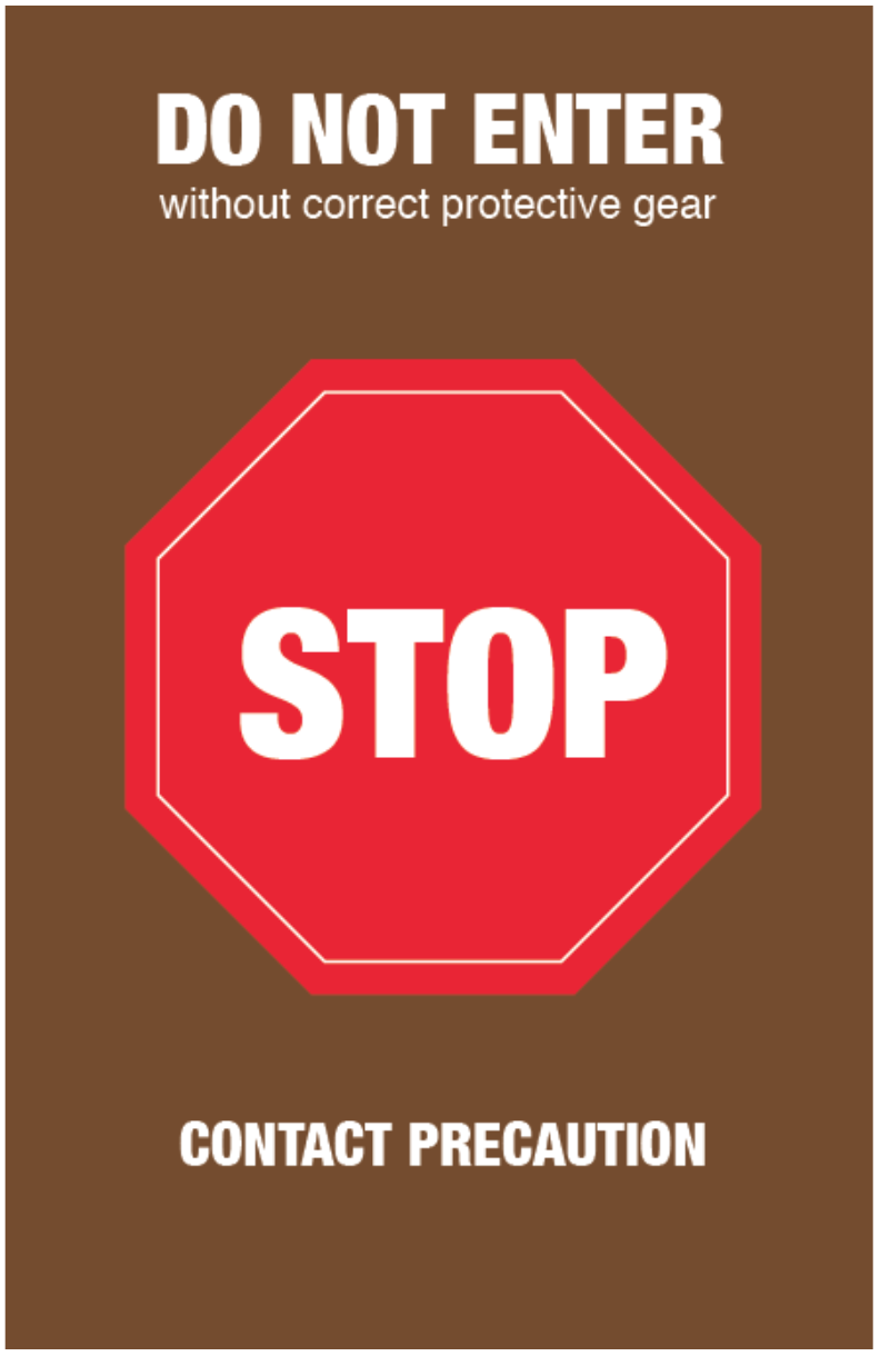
These were the posters being used at TWH to show the PPE donning and doffing process when entering a patient unit with a Contact or Droplet precaution. The brown sign is hung on the door of a room containing a patient on Contact Precaution as a reminder of what PPE should be donned before entering. A green door sign would be used for patients on Droplet Precaution, while a blue door sign would be used for patients on Airborne Precaution.
The following images depict how the signage might be hung outside of the patient room. Additionally, the cart seen in the top three pictures is referred to as an isolation cart, and contains the PPE. Although the isolation cart is typically bright yellow, it sometimes appears differently as seen in the image in the top centre in which there is a black cart instead.
ITERations
Each iteration of the signage will be explained in depth with the design changes that were made and the results that were obtained through usability testing, but to get a high-level overview of how the system evolved, click on the thumbnail to see all the iterations of the primary PPE instructional poster. See if you can spot some of the major changes that were made along the way, and try to guess why we might have made them before reading on!

Click to see all iterations
The Original Prototype
These are some of the assets that Carman and Yordanos, the graduate students who intiated the project, provided us with before leaving. At the time, they’d designed two separate posters, one to indicate what PPE to don before entering the room and in what order, and one to indicate how the PPE should be doffed after leaving the room. They also redesigned the stop sign that is placed on the door of the patient unit, and designed some additional signage to be placed around the doorway to serve as extra reminders. Finally, for the isolation cart, the students created stickers that could be placed on the drawers of the cart to indicate which garments were contained in each drawer (i.e. gloves, gowns, etc.) There was also a sanitizer sticker that was made to be placed on the hand sanitizer dispenser. The students focused on designing signage primarily for Contact Precautions as these are the most common. Athina and I performed the first round of testing with these assets.
Signage


Test Results
Logistics: October 10th, 2019 at Toronto Western Hospital
Participants: 9 healthcare workers
WHAT WORKED
- Accessibility: The greater focus on visuals rather than text in comparison to the current signage would increase accessibility for non-English speakers.
- Colours: The colours were eye-catching and attention-grabbing.
WHAT NEEDS WORK
- Information overload: There was an overwhelming number of assets in the system and participants did not know where to start/look.
- Insufficient instructions: The lack of text and minimalistic illustrations oversimplified the signage too much.
- Visibility: Although participants noticed the “Before you enter” poster when going into the room, they didn’t notice the “After you leave” poster upon exiting, and either forgot to take off the PPE or took it off from memory, which was often the incorrect order.
- Distinguishability: A number of participants assumed the entrance and exit posters were the same due to the similarity in colours and illustrations.
Intuitiveness: The steps and numbering of the steps on the stop sign posters were confusing.
- Match between system and the real world: The gloves were depicted as being disposed of in a garbage bin, which caused confusion because they are in fact meant to be disposed of in the garbage bag that is attached to the soiled linen bin which used gowns go in.
Iteration 1
Design Changes
- Reduced assets: The number of assets in the system were cut down to only include essential elements.
- Colours: Two separate, vibrant colours were used to clearly distinguish between the entrance and exit posters.
- Continuity: The doffing steps in the exit poster were changed from 1-3 to 4-6 to depict a continuous process, and also to further distinguish between the entrance and exit posters.
- Visibility: The entrance and exit posters were placed side by side so that participants would notice both of them before entering the room. The font size of the headings was also increased to draw more attention to the purpose of the posters.
- Intuitiveness: The steps were removed from the door sign.
- Match between system and the real world: The glove disposal illustration in the exit poster was revised to depict a garbage bag rather than a garbage bin.
Signage
The isolation cart stickers remained the same in this iteration.

Test Results
Logistics: October 21st-22nd, 2019 at Toronto Western Hospital
Participants: 6 healthcare workers, 2 social workers, 2 educators, 1 member of the housekeeping staff, 1 patient visitor
WHAT WORKED
- Visibility: Participants liked that the entrance and exit posters were clearly distinguishable rather than having everything crammed together like in the current signage.
- Colours: The pink and green colours were found to be eye-catching and attention-grabbing.
WHAT NEEDS WORK
- Insufficient instructions: Participants wanted the signage to have more guidance in the form of simple textual instructions.
- Visibility of stickers/accessibility of storage cart: HCWs knew to go into the cart to obtain PPE, but did not notice the stickers. The visitor did not notice the stickers, and did not think PPE would be in the storage cart, which prevented them from finding the PPE.
- Intuitiveness: Some illustrations were found to be unnecessary, such as the second illustration of the user donning their gloves in the entrance poster.
Iteration 2
Design Changes
- Textual instructions: Further guidance was provided through the addition of single-word instructions. Also, the word “room” was added to the headings of the entrance and exit posters to indicate the immediacy of the action (i.e. PPE must be doffed right after exiting the room).
- Visibility of stickers: The size of the stickers was increased from 2.1” x 2.1” to 3.5” x 3.5” for greater visibility. Text labels were also added to the stickers, and their shape was changed for consistency with the PPE poster.
- Reduced clutter: The number of illustrations was reduced to only have one per step as many of the illustrations were not found to be useful by participants.
- Reduced assets: The entrance and exit posters were merged and printed on a single sheet to reduce the number of assets that the HCWs would need to handle during setup.
- Intuitiveness: The steps were removed from the door sign.
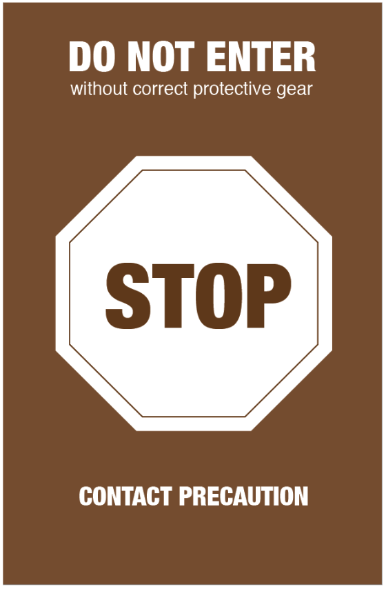
- Readability: The step numbers and icons were separated for easier readability. Also, the stop sign on the door poster was changed from red to white to increase its contrast against the brown background.
Signage

Test Results
This time around, Athina and I presented the updated posters to our coworkers during one of our team Design Crits to get their feedback on both the UX and the design of the system.
WHAT WORKED
- Illustrations: The drawings were found to have just enough detail to convey what actions needed to be completed.
WHAT NEEDS WORK
- Comprehension of terms: The word “Contact” in the bottom banner of the poster did not mean anything to our coworkers, which they mentioned would be a concern if they were visiting a loved one as they would worry about what the word implied.
- Comprehension of instructions: The single-word instructions were not found to add much value.
- Miscommunication: Our coworkers felt that the green background used in the exit poster might confuse users - particularly HCWs - into thinking that the poster was for a Droplet Precaution, for which the isolation colour is green.
- Visibility: The headings of the entrance and exit posters were still being overlooked, causing users to miss the purpose of the posters.
- Mental connection: Despite the use of stickers, there still was not a distinct connection between the signage and the storage cart that contains the PPE.
Iteration 3
Design Changes
- Comprehension of terms: The word “contact” in the bottom banner of the poster was replaced with “Precaution: for anyone entering this room” to make it feel more targeted towards all entrants, visitors included. The brown background was retained so that HCWs would still know that the poster was for a Contact Precaution.
- Actionable instructions: The single-word instructions were rephrased to be action items.
- Colours: The green background of the exit poster was changed to teal to avoid mistaking it for a Droplet Precaution.
- Visibility: The look of the entrance and exit posters’ headings were adjusted to further emphasize the purpose of the posters.
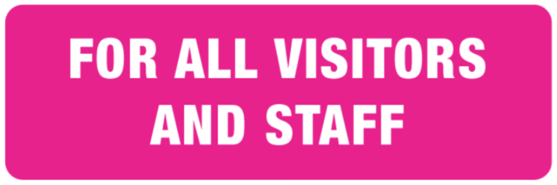
- Isolation cart label: An additional “For all visitors and staff” label was created for the storage cart to make it clear that visitors were also allowed to interact with the cart and get PPE out of it.
- Precaution banner: The text was changed from just “Precaution” to “Precaution: for anyone entering this room” to emphasize that the signage was targeted at all entrants.
Signage
The isolation cart stickers and stop sign remained the same in this iteration.

Test Results
Logistics: November 4th, 2019 at Toronto Western Hospital
Participants: 2 healthcare workers, 1 social workers, 1 member of the housekeeping staff, 2 patient visitors, 1 medical student, 1 nursing student
WHAT WORKED
- Distinguishability: The entrance steps were clearly distinguishable from the exit steps due to the large headings and different colour schemes.
- Accessibility of isolation cart: Participants not only felt comfortable interacting with the cart, but also found it easier to use because of the stickers which prevented them from having to search through each drawer for the correct PPE.
WHAT NEEDS WORK
- Poster size: Put together the entrance and exit posters were 18” x 22.5”. In this round of testing the poster was placed directly outside a patient’s room as it would be in real life, and it was found that the poster was too large to fit on the narrow wall outside the room.
- Comprehension of stickers: Since the stickers on the storage cart just said “gown”, “glove”, etc., visitors might accidentally deposit soiled PPE back in the drawers.
- Comprehension of step numbers: Since the step numbers go from 1-6, users may think they need to complete all the steps in continuation. Having the steps in the exit sign be numbered from 4-6 rather than 1-3 was more necessary when the entrance and exit posters were both pink, but now the two posters are clearly distinguishable by colour.
Iteration 4
The Iteration 3 signage was also presented to IPAC, the Patient Education team, Administrative Executives, and Nurse Managers, and based on their feedback as well as the users' feedback, we made the following design changes.
Design Changes
- Mixed case text for accessibility: According to an article in Adobe Blogs titled Considerations for Inclusive and Accessible Design, users with dyslexia struggle to read text that is written in all caps. As such, we changed the majority of the text to title case.
- Accessible colours: The background colours were adjusted to better accommodate users with colour-blindness based on a test with an individual who is red green colourblind (and also happens to be my brother) and using the accessible-colors.com tool.
- Labels: We were informed that garbage and soiled bins are not always consistent in appearance across different patient units. As such, we added simple “garbage” and “soiled bin” labels to indicate where used PPE should go.
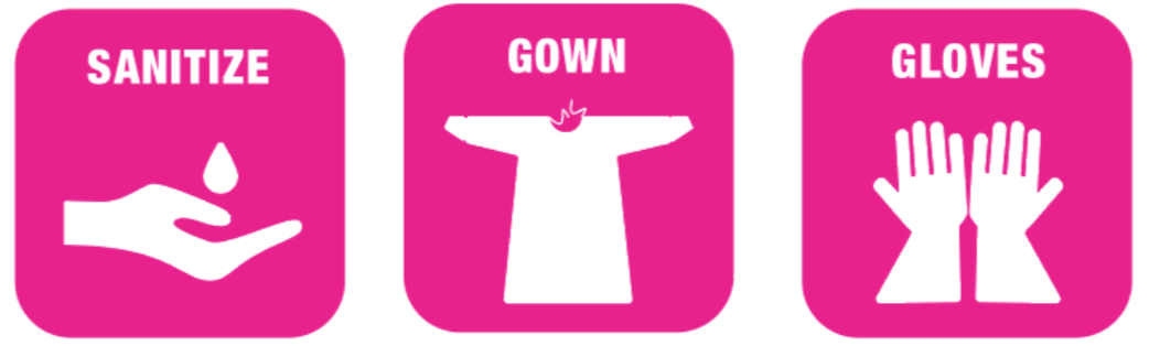
- Terminology: The first step in the entrance poster was previously captioned “sanitize hands”. At TWH, rather than “sanitize”, the word “wash” is commonly used. However, since lay people may mistake this to mean they need to wash their hands with water, we used “clean hands” as the middle ground. We also changed the word “PRECAUTION” in the top banner to “STOP” since this is more of an actionable instruction.
- Step numbers: The step numbers in the exit poster were changed from 4-6 back to 1-3 to indicate that this was a separate process to be completed after leaving the room.
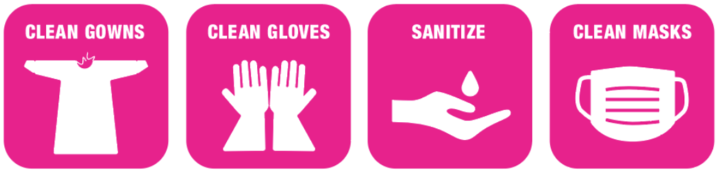
- Isolation cart stickers: The word “clean” was added to the stickers for the storage cart to clearly indicate that the cart was only meant for fresh PPE not used PPE.
- Poster size: The size of the PPE poster was reduced to 17” x 14” to ensure a better fit outside the patient room.
Signage
The stop sign remained the same in this iteration.

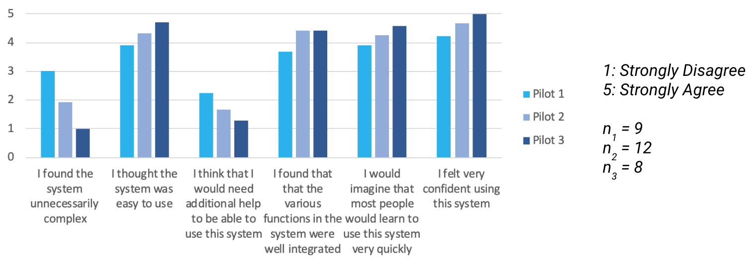
In addition to running usability tests at TWH, we had participants fill out exit surveys for each of the three user test sessions. These surveys incorporated System Usability Scale questions that enabled us to collect quantitative data about the usability of the system. The following chart shows that the usability significantly improved over the course of the iterations, with the final test (Pilot 3) representing the scores obtained based on Iteration 3 of the system, the final version in which we tested real users.
Final Iteration
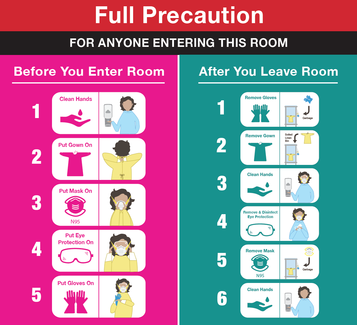
After the last design iteration, it was finally time to trial the posters at TWH in place of the PPE signage that is currently being used. That meant designing the Airborne Precaution, Droplet Precaution, and Contact MRSA Precaution signage in addition to the Contact Precaution signage. Carman and Yordanos had already designed the majority of these assets in the original style as well, but after making all the relevant updates, Athina and I realized we had one major issue.
The green colour that was linked to Droplet Precautions was too similar to the teal background we’d used for the exit posters, making the contrast between the top banner and the exit poster too low, as seen below.

The solution? We simply added a black break banner in between the top banner and the rest of the sign. This way, the healthcare workers would still be able to refer to the colour of the top banner as an indication of what type of precaution the poster was for, which would assist them in selecting the correct assets when setting up an isolation room. The final versions of all of the assets are as follows.
Contact Precaution sign
Contact MRSA Precaution sign
Airborne Precaution sign
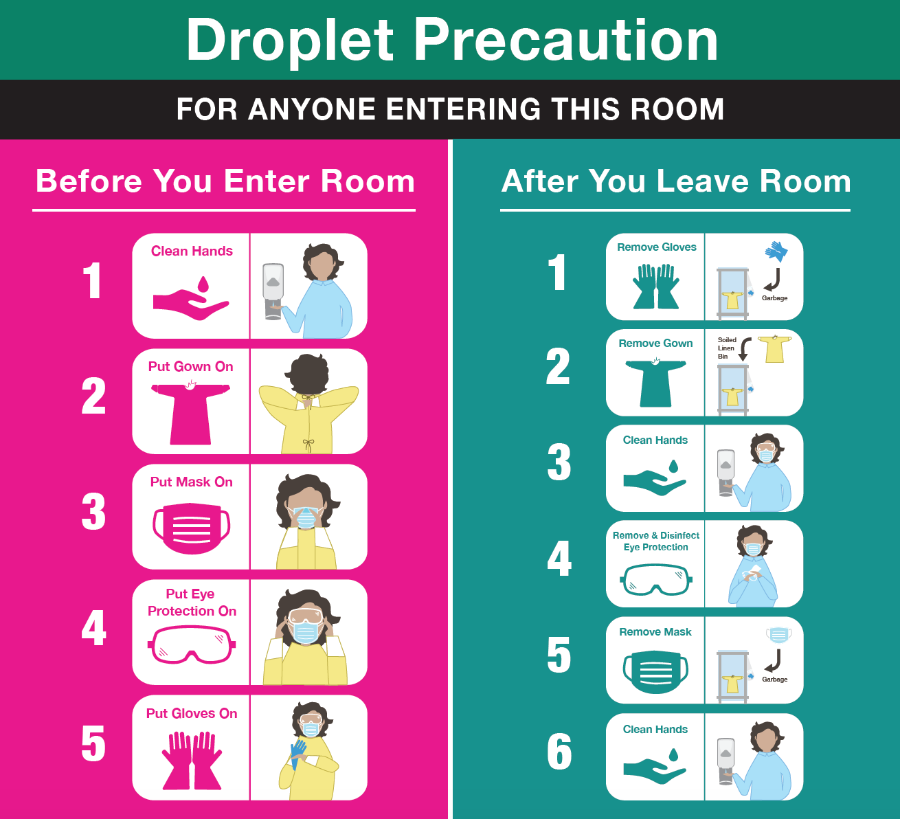
Droplet Precaution sign
Door stop signs for Contact, Contact MRSA, Droplet, and Airborne Precautions
Isolation cart stickers
Isolation cart labels
Lessons learned
- Iterative design is no joke. Carman and Yordanos went through multiple iterations of their own to design the original prototype. Since then, the system underwent more than seven design iterations just to get it to the trial stage that we are at today. The test results from each iteration prove that unless we had repeatedly gone back to the drawing board, the number of usability issues would have been immense. That being said, at some point it’s also necessary to ditch the drawing board and ship the product. Even today, Athina and I know that there are certain aspects of the signage that could use more tweaking, but these tweaks are never-ending, and at this point it’s important to see what impact the system has once it’s integrated into everyday use.
- The value of simulation. When we were testing with certain users, if they were in a rush, they’d simply tell us what they would do and how they would use the new signage rather than actually going through the motions of donning and doffing the PPE using the instructional poster. While this was better than getting no feedback at all, if we were later able to get that same participant to go through the simulation of visiting an isolation precaution room, we noticed that what they actually did differed from what they said they would do. Hypotheticals can only be so accurate.
- Ethnographic research in action. Conducting the usability tests in actual patient units where the signage would be used helped us to pick up on factors that we may not have noticed if we conducted the tests elsewhere. For example, we realized that the walls outside patient rooms are often covered with posters and announcements, making it all the more important to ensure that our posters were attention-grabbing and clearly distinguishable from other hospital signage. Another example was that we witnessed how healthcare workers are constantly multitasking while on duty, as they have to keep tabs on multiple patients at the same time. This emphasized the importance of keeping the posters as simple and easy to digest as possible to avoid further overwhelming the HCWs, and also pushed us to get rid of the extra illustrations in our posters.
Ultimately, this experience was truly an eye-opening one for me as it enabled me to appreciate the time and consideration that goes into designing new systems in a complex institution like a hospital. I also developed a stronger sense of empathy after working with people ranging from HCWs to patient family members to medical students, as I was able to witness the ins and outs of the healthcare system through multiple different perspectives, and understand the needs of different user groups. Finally, I was lucky to work and learn alongside Athina, who worked patiently with me to develop my design skills, and gave me the freedom to explore and even take leadership of such an interesting project!
WORD BANK
- Personal Protective Equipment (PPE): Proper use of personal protective equipment (PPE) protects both the patient and the health care worker from transmission of communicable diseases. PPE includes gloves, gown and apron, mask or respirator, and eye protection.
- Healthcare Workers (HCWs): A healthcare worker is one who delivers care and services to the sick and ailing either directly as doctors and nurses or indirectly as aides, helpers, laboratory technicians, or even medical waste handlers.
- Toronto Western Hospital (TWH): The Toronto Western Hospital is a major research and teaching hospital in Toronto, Ontario, Canada. It is part of the University Health Network. It has 256 beds, with 46,000 visits to its emergency department annually.
- Infection Prevention and Control (IPAC): Infection Prevention and Control (IPAC) is a corporate service for UHN's four hospitals. Their mandate is to increase the quality of patient care by identifying sources of infections and preventing their spread through surveillance, education and consultation.
- Contact Precaution (isolation colour - brown): Contact Precautions are designed to reduce the risk of transmission of microorganisms by direct or indirect contact.
- Contact MRSA Precaution (isolation colour - brown (+ dashed lines for distinguishability from regular Contact Precaution)): Whenever possible, patients with MRSA will have a single room or will share a room only with someone else who also has MRSA.
- Droplet Precaution (isolation colour - green): Droplet Precautions are designed to reduce the risk of droplet transmission of infectious agents. Infectious droplets are released when the infected person sneezes or coughs and the large droplet spray may spread as far as three feet.
- Airborne Precaution (isolation colour - blue): Airborne Precautions are designed to reduce the risk or eliminate the airborne transmission of infectious agents. The infectious particles are so small that they can remain suspended in the air for long periods of time and are carried on air currents.
- Isolation Cart: Isolation carts provide a convenient location for personal protective equipment (PPE) necessary to provide care for patients on isolation precautions.